The dining room is the room we use most after dark, which makes it the natural place for colour that only comes alive in the evening. Deep green, chocolate, ink and burgundy wrap a table in warmth, quieten a big open space and make a weeknight supper feel like an occasion.
The search data agrees. Houzz's 2026 UK Emerging Trends report found interest in moody living rooms and forest green has more than doubled, with searches for dark green bedrooms up 46%. The table is what decides whether a dark dining room feels rich or just dim, so this guide starts there.
Why Dark Works in a Dining Room
A pale scheme that looks crisp at midday often reads flat and clinical at eight in the evening under artificial light. Deep colour does the opposite. It absorbs the edges of the room, lets the light fall where you want it, and turns the table into the brightest, most important thing in the space.
- It cocoonsDark walls pull the room in around the table, which is exactly the feeling you want for a long dinner.
- It hides the hard edgesRadiators, sockets and awkward corners fade into a dark wall in a way they never do into white.
- It flatters stoneVeining, depth and polish all read more strongly against a deep backdrop.
Dark on Dark: Tops That Deepen the Mood
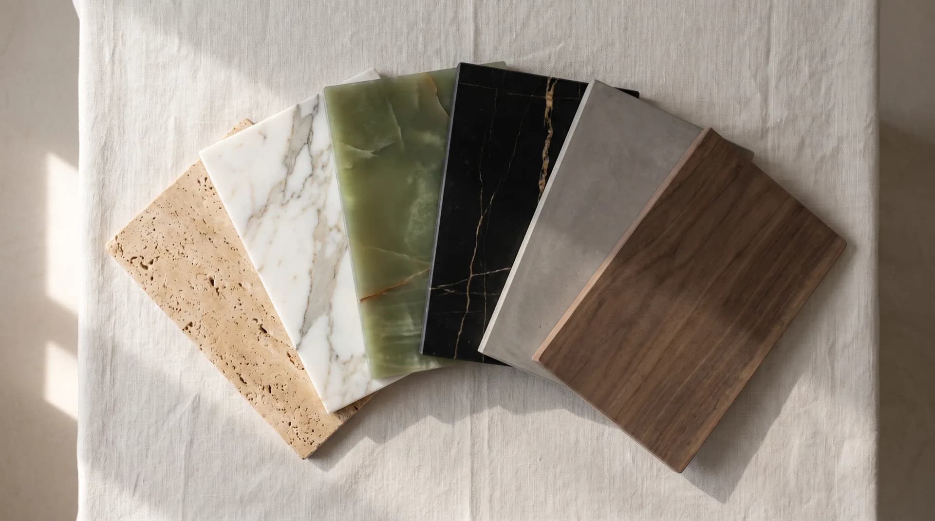
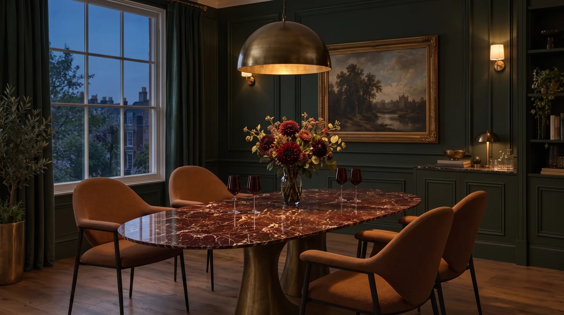
For the full cocooning effect, take the table as dark as the walls and let the veining provide the light. Our darker porcelain tops each pair with a different palette:
| Top | Character | Pairs with |
|---|---|---|
| Venus Vein | Burgundy base, white and silver veining, polished | Forest green, olive, aged brass |
| Sienna Bronze | Deep charcoal with fine copper and bronze veining | Chocolate brown, terracotta, walnut |
| Vintage Bronze | Burnished browns, charcoal and copper undertones | Ochre, rust, warm plaster |
| Calacatta Black | Black marble effect with striking white veining | Navy, ink, charcoal, crisp brass |
| Noce | Rich walnut tones with a silk texture | Olive, sage, mid-century timber |
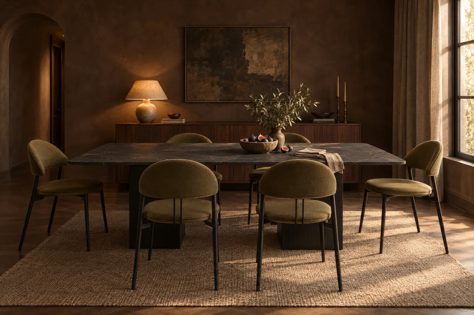
Dark on dark works best when there is a clear contrast somewhere else. Pale veining, a metallic base or lighter chair upholstery gives the eye a place to land, so the table reads as a deliberate piece rather than a dark shape in a dark room.
Light Against Dark: The Table as the Glow
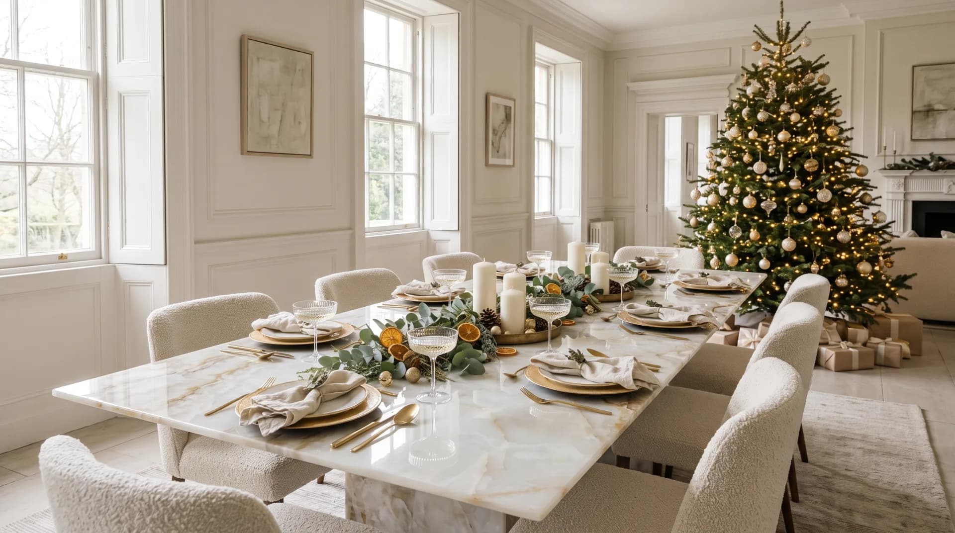
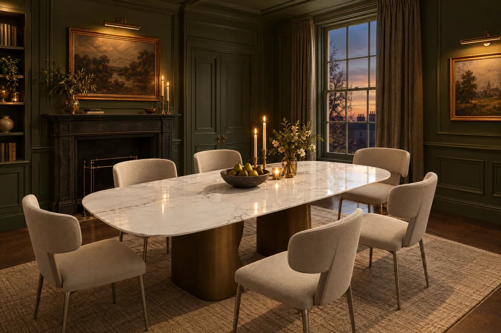
The alternative is to keep the walls deep and the top pale. A white or cream marble-effect surface against olive or forest green becomes the brightest thing in the room, catches every bit of light and makes a dark scheme feel generous rather than heavy. It also suits households who love dark walls but want a table that still feels fresh at breakfast.
Finish Matters More After Dark
In a dark room the finish of the top changes the mood as much as its colour. Every BeMade top comes in a polished, silk or natural finish, and each behaves differently under low light. Our guide to polished, silk and natural finishes goes into detail.
- PolishedMirrors candlelight and pendants, so the table glitters and the veining looks deep and wet. The most dramatic choice for evening dining.
- SilkA soft sheen that warms the colour without sharp reflections. A good middle ground for rooms used morning and night.
- NaturalA matte surface that lets light pool softly with no glare. It looks closest to honed stone and suits quiet, tactile schemes.
Light the Table, Not the Room
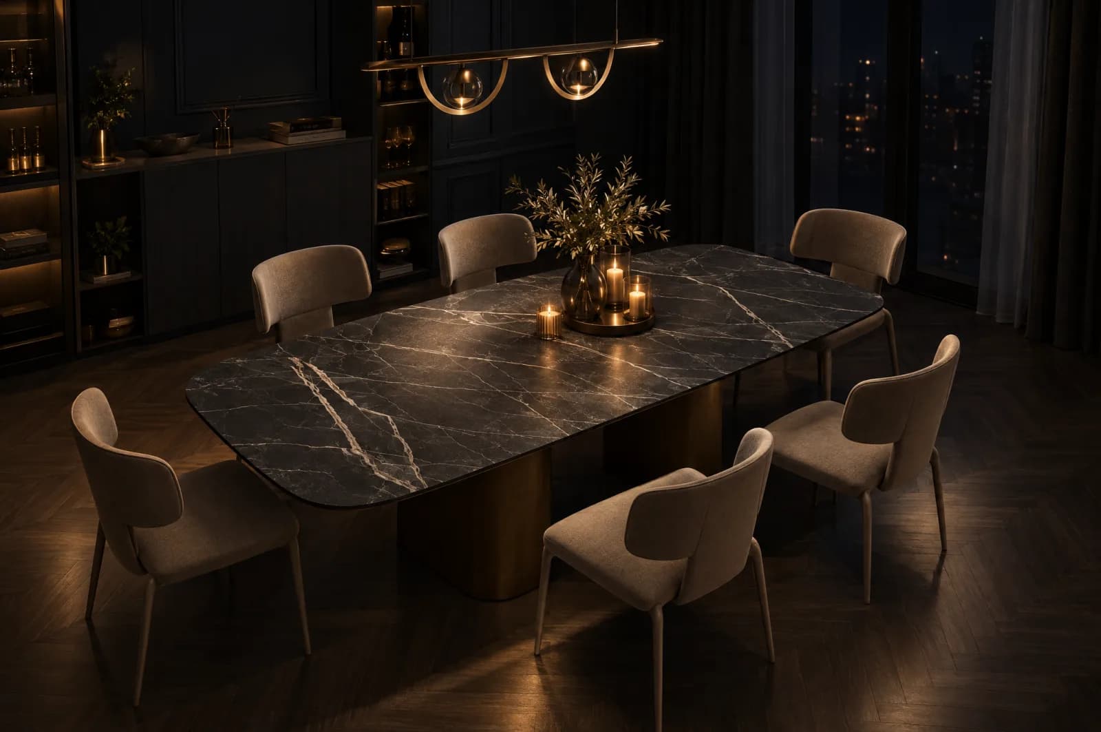
Dark rooms depend on good lighting. The aim is a pool of warm light on the table with the rest of the room falling gently into shadow.
- Hang the pendant lowAround 75cm to 85cm above the table top, centred on the table rather than the ceiling.
- Choose warm bulbs2700K or warmer keeps dark paint rich. Cooler light turns green grey and brown muddy.
- Fit a dimmerThe same room has to work for a family tea at six and a dinner party at nine.
- Add low light around the edgesPicture lights, a lamp on the sideboard and candles on the table stop the walls disappearing entirely.
Bases and Chairs
Metal finishes carry a lot of the warmth in a dark scheme. Brass and champagne tones glow against green and navy, while a black or graphite base disappears into the shadows and lets the top float. Browse the table bases to see every finish.
For chairs, upholstery in olive, tan, taupe or brown sits comfortably in a moody palette and softens the hard surfaces. Our chairs come in tones that work with dark walls, and you can see them next to the darker tops at our Preston showroom.
Final Thoughts
A dark dining room is a commitment to the evening, and it rewards it. Choose the top first, decide whether it should match the depth of the walls or shine against them, then pick the finish for the light you will eat by.
Order samples and look at them at night before you decide. If you want a second opinion, book a call and we will talk through your scheme.
Frequently asked questions
Last updated 14 October 2026